[CSS] CSSで三角形が描ける!?borderの使い方を徹底解説するよ!
CSSで三角形ってどう描くの…?
そんな疑問に答えます!
CSS絵の他にも、矢印やリボンを描くなど、サイトデザインやブログカスタマイズにも使えます💡
Contents
borderを使った三角形の書き方
具体的なコードはこちらです。
<div class='triangle'></div>.triangle{
height: 0px;
width: 0px;
border-right: 45px solid transparent;
border-left: 45px solid transparent;
border-bottom: 90px solid #c6eeee;
}borderで三角形が書ける仕組み
見やすいようにborderの色を変えてみます。この時点でも、よく見ると四隅に斜めの角がありますね💡
<div style='
width: 100px;
  height: 100px;
  border-width: 10px;
  border-style: solid;
  border-left-color: yellow;
  border-right-color: blue;
  border-top-color: red;
  border-bottom-color: green;
'></div>
borderをどんどん太くしていくと、斜めの部分が大きくなります。
<div style='
width: 100px;
  height: 100px;
  border-width: 25px;
  border-style: solid;
  border-left-color: yellow;
  border-right-color: blue;
  border-top-color: red;
  border-bottom-color: green;
'></div>
borderが一定以上太くなると、三角形が出現します。
<div style='
width: 100px;
  height: 100px;
  border-width: 50px;
  border-style: solid;
  border-left-color: yellow;
  border-right-color: blue;
  border-top-color: red;
  border-bottom-color: green;
'></div>
CSSではこの特性を利用して、三角形を描いています!
この例では、違う色の三角形が4つできています。
1つだけ三角形を作りたい時は、1箇所だけborderを指定して、他をtransparent(=透明)にすることで、1個の三角形を作ることが可能です。
色々な向きの三角形
上で紹介した三角形は上を向いていますが、borderの位置と角度を調整することで、様々な三角形を作ることが可能です。
基本的にはこれで自由に三角形を作れるので、色々試してみてください💡
- 尖らせたい向きと逆のborderに色を指定、その両脇はtransparent
- 角度が大きくなるほど鋭角になる
コードをすっきり短くするため、CSSはHTMLの『style=’ '』の中に描いています💡
左向き
<div class='tr-left'
   style='
     height: 0px;
     width: 0px;
     border-top: 45px solid transparent;
     border-right: 90px solid #c6eeee;
     border-bottom: 45px solid transparent;
'></div>
右向き
<div class='tr-right'
   style='
     height: 0px;
     width: 0px;
     border-top: 45px solid transparent;
     border-left: 90px solid #c6eeee;
     border-bottom: 45px solid transparent;
'></div>
下向き
<div class='tr-bottom'
   style='
     height: 0px;
     width: 0px;
     border-right: 45px solid transparent;
     border-left: 45px solid transparent;
     border-top: 90px solid #c6eeee;
'></div>
おまけ①:矢印の書き方
使用テーマによっては間隔が変わるかもしれないので、お使いのテーマに合わせて使ってみてください。
Point
<div class='point'>Point
    <div class='arrow'></div>
  </div>
.point{
height: 30px;
width: 50px;
background: #c6eeee;
text-align: center;
box-sizing: border-box;
padding: .2em;
}
.arrow{
height: 0px;
width: 0px;
border-right: 45px solid transparent;
border-left: 45px solid transparent;
border-top: 45px solid #c6eeee;
position: relative;
right: 50%;
bottom: 20%; /*上の四角との距離*/
}おまけ②:リボン風デザインの書き方
Ribbon Design
<div class='ribbon'>
 <div class='text'>Ribbon Design</div>
</div>
.ribbon {
display: inline-block;
position: relative;
height: 45px;
text-align: center;
box-sizing: border-box;
}
.ribbon:before {
content: '';
position: absolute;
width: 10px;
top: 35%;
left: -25px;
z-index: 1;
border: 20px solid #b1e3e2;
border-left-color: transparent;/*山形に切り抜き*/
}
.ribbon:after {
content: '';
position: absolute;
width: 10px;
top: 35%;
right: -25px;
z-index: 1;
border: 20px solid #b1e3e2;
border-right-color: transparent;
}
.text {
display: inline-block;
position: relative;
margin: 0;
padding: 0 20px;
line-height: 45px;
background: #c6eeee;
z-index: 2;
}
.text:before {
position: absolute;
content: '';
top: 100%;
left: 0;
border: none;
border-bottom: solid 10px transparent;
border-right: solid 15px #a6d3c8;
}
.text:after {
position: absolute;
content: '';
top: 100%;
right: 0;
border: none;
border-bottom: solid 10px transparent;
border-left: solid 15px #a6d3c8;
}最後に
以上!
CSSでの三角形の書き方、楽しんでいただけでしょうか?
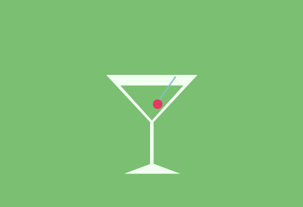
トップの画像も、この方法を使って三角形のグラスを描いています。
下記リンクをクリックして、コードをチェックしてみてください!
🌾形崩れする場合は×0.25で見てみてください💡