[CSS] モノトーンがお洒落なアニメーションボタン16選
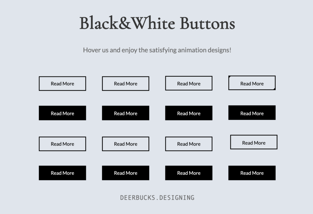
CodePenに投稿した白黒モノトーンボタン、好評だったので作り方を解説していきます。
気に入ったデザインがあれば、コピペして使ってもOKです!
See the Pen Black&White Button by Yuhomyan (@yuhomyan) on CodePen.
CSS、HTMLが得意な人はCodePenに直接飛んで見た方が早いかも🤔
共通のCSS
以下のCSSは、全てのボタンで共通です。これに、適宜気に入ったCSSを付け足して使ってください。
.custom-btn {
  width: 130px;
  height: 40px;
  padding: 10px 25px;
  border: 2px solid #000;
  font-family: 'Lato', sans-serif;
  font-weight: 500;
  font-size: 14px;
  background: transparent;
  cursor: pointer;
  transition: all 0.3s ease;
  position: relative;
  display: inline-block;
}
にゅ〜っと浮き上がる
:hoverでbox-shadowを4つ指定することで、にゅーっと浮き上がったように見せています。逆に、全てにinsetを付けると凹んだように見せることも可能です。
<button class="custom-btn btn-1">Read More</button>.btn-1 {
transition: all 0.3s ease;
}
.btn-1:hover {
box-shadow:
-7px -7px 20px 0px #fff9,
-4px -4px 5px 0px #fff9,
7px 7px 20px 0px #0002,
4px 4px 5px 0px #0001;
}囲み枠が二重になる
疑似クラス:afterで小さなボックスを作ります。普段はopacity: 0; で完全に透明で見えませんが、hoverしている間はopacity: 1; と設定することで見えるようになります。
<button class="custom-btn btn-2">Read More</button>.btn-2 {
transition: all 0.3s ease;
}
.btn-2:after {
position: absolute;
content: "";
top: 5px;
left: 6px;
width: 90%; /* 内側のボックスの幅 */
height: 70%; /* 内側のボックスの高さ */
border: 1px solid #000; /* 内側の線の太さ・種類・色 */
opacity: 0; /* 完全に透明 */
transition: all 0.3s ease;
}
.btn-2:hover:after {
opacity: 1; /* 完全に不透明 */
}
ボーダーが太くなる
正確にはborderではなく、backgroundを使って指定しています。
高さ・幅を普段は0%、hover時に100%に指定することで、hoverしている間だけ太い線が出現します。
ボタン自体の:before&:afterに加え、spanの:before&:afterを追加することで4本の線を作りました。
<button class="custom-btn btn-3"><span>Read More</span></button>.btn-3 {
line-height: 39px;
padding: 0;
}
.btn-3:hover{
background: transparent;
color: #000;
}
.btn-3 span {
position: relative;
display: block;
width: 100%;
height: 100%;
}
.btn-3:before,
.btn-3:after {
position: absolute;
content: "";
left: 0;
top: 0;
background: #000; /* 線の色 */
transition: all 0.3s ease;
}
.btn-3:before {
height: 0%;
width: 2px; /* 線の太さ */
}
.btn-3:after {
width: 0%;
height: 2px; /* 線の太さ */
}
.btn-3:hover:before {
height: 100%;
}
.btn-3:hover:after {
width: 100%;
}
.btn-3 span:before,
.btn-3 span:after {
position: absolute;
content: "";
right: 0;
bottom: 0;
background: #000; /* 線の色 */
transition: all 0.3s ease;
}
.btn-3 span:before {
width: 2px; /* 線の太さ */
height: 0%;
}
.btn-3 span:after {
width: 0%;
height: 2px; /* 線の太さ */
}
.btn-3 span:hover:before {
height: 100%;
}
.btn-3 span:hover:after {
width: 100%;
}二重のボックスが現れる
疑似クラス:before&:afterを使ってボックスを作りました。
こちらもborderの普段の色をtransparent(透明)、hover時を#000にしています。
<button class="custom-btn btn-4">Read More</button>.btn-4 {
position: relative;
color: #000;
z-index: 2;
line-height: 40px;
padding: 0;
}
.btn-4:hover{
border: none;
}
.btn-4:before,
.btn-4:after {
position: absolute;
content: "";
width: 0%;
height: 0%;
border: 2px solid transparent;
z-index: -1;
transition: all 0.3s ease;
}
.btn-4:before {
top: 0;
left: 0;
}
.btn-4:after{
bottom: 0;
right: 0;
}
.btn-4:hover:before,
.btn-4:hover:after {
border-color: #000;
height: 100%;
width: 100%;
}上下にボーダーが出現
こちらも高さ2pxのbackgroundで線を作っています。ボタン本体の背景色は、hover時に透明にしています。
<button class="custom-btn btn-5"><span>Read More</span></button>.btn-5 {
background: #000;
color: #fff;
line-height: 42px;
padding: 0;
border: none;
}
.btn-5:hover {
background: transparent;
color: #000;
box-shadow:
-7px -7px 20px 0px #fff9,
-4px -4px 5px 0px #fff9,
7px 7px 20px 0px #0002,
4px 4px 5px 0px #0001;
}
.btn-5:before,
.btn-5:after{
content:'';
position:absolute;
top:0;
right:0;
height:2px;
width:0;
background: #000;
transition:400ms ease all;
}
.btn-5:after{
right:inherit;
top:inherit;
left:0;
bottom:0;
}
.btn-5:hover:before,
.btn-5:hover:after{
width:100%;
transition:800ms ease all;
}回転しながらボーダーが出現
こちらもspanでbackgroundの線を4本作りました。見やすいようにアニメーションの速度はゆっくり目にしています。
<button class="custom-btn btn-6"><span>Read More</span></button>.btn-6 {
background: #000;
color: #fff;
line-height: 42px;
padding: 0;
border: none;
}
.btn-6 span {
position: relative;
display: block;
width: 100%;
height: 100%;
}
.btn-6:before,
.btn-6:after {
position: absolute;
content: "";
height: 0%;
width: 2px;
background: #000;
}
.btn-6:before {
right: 0;
top: 0;
transition: all 500ms ease;
}
.btn-6:after {
left: 0;
bottom: 0;
transition: all 500ms ease;
}
.btn-6:hover{
color: #000;
background: transparent;
}
.btn-6:hover:before {
transition: all 500ms ease;
height: 100%;
}
.btn-6:hover:after {
transition: all 500ms ease;
height: 100%;
}
.btn-6 span:before,
.btn-6 span:after {
position: absolute;
content: "";
background: #000;
}
.btn-6 span:before {
left: 0;
top: 0;
width: 0%;
height: 2px;
transition: all 500ms ease;
}
.btn-6 span:after {
right: 0;
bottom: 0;
width: 0%;
height: 2px;
transition: all 500ms ease;
}
.btn-6 span:hover:before {
width: 100%;
}
.btn-6 span:hover:after {
width: 100%;
}背景が上下に開いて消える
hover時の、ボタン本体の背景を透明×疑似コードの高さを0×アニメーション(transition)を組み合わせることで、開いて消える
:before&:afterのz-index: -1;を指定しないと、ボタンの文字が見えなくなってしまうので注意です。
<button class="custom-btn btn-7">Read More</button>.btn-7 {
background: #000;
color: #fff;
line-height: 42px;
padding: 0;
border: none;
z-index: 1;
-webkit-transition: all 0.3s linear;
transition: all 0.3s linear;
}
.btn-7:hover {
background: transparent; /* 背景色を透明 */
color: #000;
}
.btn-7:before,
.btn-7:after {
position: absolute;
content: "";
left: 0;
width: 100%; /* 黒い背景の幅 */
height: 50%; /* 50%に設定することで中心から開く様に見える */
right: 0;
z-index: -1; /* 下に */
background: #000;
transition: all 0.3s ease;
}
.btn-7:before {
top: 0;
}
.btn-7:after {
bottom: 0;
}
.btn-7:hover:before,
.btn-7:hover:after {
height: 0;
background-color: #000;
}パタッと開く
afterで黒い部分を作っています。
rotateX(数字)は、要素を水平軸の周りを回転させる働きをします。
詳しくはこの記事などを参照してください。
<button class="custom-btn btn-8">Read More</button>.btn-8 {
line-height: 40px;
padding: 0;
background: transparent;
position: relative;
z-index: 2;
color: #fff;
-webkit-perspective: 300px;
perspective: 300px;
-webkit-transform-style: preserve-3d;
transform-style: preserve-3d;
}
.btn-8:hover{
color: #000;
}
.btn-8:after {
position: absolute;
content: "";
top: 0;
left: 0;
width: 100%;
height: 100%;
background: #000;
z-index: -1;
-webkit-transform-origin: center bottom;
transform-origin: center bottom; /* 回転軸 */
-webkit-transform: rotateX(0);
transform: rotateX(0);
transition: all 0.3s ease;
}
.btn-8:hover:after {
-webkit-transform: rotateX(-180deg);
transform: rotateX(-180deg);
}キラッと背景が出現
afterでキラッと回転する黒い背景を作っています。
overflow: hidden; を指定しないと、画面いっぱいに広がってしまうので注意です。
<button class="custom-btn btn-9">Read More</button>.btn-9 {
z-index: 2;
transition: all 0.3s ease;
overflow: hidden; /* after:の部分ボタン内におさまる */
}
.btn-9:after {
position: absolute;
content: " ";
z-index: -1;
top: 0;
left: 0;
width: 100%;
height: 100%;
transition: all 0.3s ease;
}
.btn-9:hover {
box-shadow: 4px 4px 6px 0 rgba(255,255,255,.5),
-4px -4px 6px 0 rgba(116, 125, 136, .2),
inset -4px -4px 6px 0 rgba(255,255,255,.5),
inset 4px 4px 6px 0 rgba(116, 125, 136, .3);
color: #fff;
}
.btn-9:hover:after {
-webkit-transform: scale(2) rotate(180deg);
transform: scale(2) rotate(180deg);
background: #000;
box-shadow: 4px 4px 6px 0 rgba(255,255,255,.5),
-4px -4px 6px 0 rgba(116, 125, 136, .2),
inset -4px -4px 6px 0 rgba(255,255,255,.5),
inset 4px 4px 6px 0 rgba(116, 125, 136, .3);
}奥から背景が迫ってくる
transform: scale(数字); で黒い背景がずんっとやってくる感じを出しています。scale()内の数字は、元の要素に対する大きさの倍率を表しています。
<button class="custom-btn btn-10">Read More</button>.btn-10 {
position: relative;
transition: all 0.3s ease;
overflow: hidden;
z-index: 2;
}
.btn-10:after {
position: absolute;
content: "";
top: 0;
left: 0;
width: 100%;
height: 100%;
transition: all 0.3s ease;
-webkit-transform: scale(.1);
transform: scale(.1);
}
.btn-10:hover {
color: #fff;
}
.btn-10:hover:after {
background: #000;
-webkit-transform: scale(1);
transform: scale(1);
}使っているテーマ等によっては、正しく表示されないかもしれません。その場合は以下のコードを試してみてください。
.btn-10 {
  position: relative;
  transition: all 0.3s ease;
  overflow: hidden;
  z-index: 2;
}
.btn-10:after {
  position: absolute;
  content: "Read More";
 line-height: 40px;
 color: #fff;
  top: 0;
  left: 0;
  width: 100%;
  height: 100%;

  transition: all 0.3s ease;
  -webkit-transform: scale(.1);
  transform: scale(.1);
}
.btn-10:hover {
  color: #fff;
}
.btn-10:hover:after {
  background: #000;
  -webkit-transform: scale(1);
  transform: scale(1);
}
時々キラッと光る
企業サイトなどで時々見かける、キラッと光るボタンです。
<button class="custom-btn btn-11">Read More</button>.btn-11 {
overflow: hidden;
transition: all 0.3s ease;
}
.btn-11:hover {
background: #000;
color: #fff;
}
.btn-11:before {
position: absolute;
content: '';
display: inline-block;
top: -180px;
left: 0;
width: 30px;
height: 100%;
background-color: #fff;
animation: shiny-btn1 3s ease-in-out infinite;
}
.btn-11:active{
box-shadow: 4px 4px 6px 0 rgba(255,255,255,.3),
-4px -4px 6px 0 rgba(116, 125, 136, .2),
inset -4px -4px 6px 0 rgba(255,255,255,.2),
inset 4px 4px 6px 0 rgba(0, 0, 0, .2);
}
@-webkit-keyframes shiny-btn1 {
0% { -webkit-transform: scale(0) rotate(45deg); opacity: 0; }
80% { -webkit-transform: scale(0) rotate(45deg); opacity: 0.5; }
81% { -webkit-transform: scale(4) rotate(45deg); opacity: 1; }
100% { -webkit-transform: scale(50) rotate(45deg); opacity: 0; }
}クルッと回転
こちらもrotateX()を使って回転させています。perspectiveは奥行きを加える働きをします。
ちなみに文字が書いてあるのはbuttonではなくspanの方です。
<button class="custom-btn btn-12"><span>Click!</span><span>Read More</span></button>.btn-12{
position: relative;
right: 20px;
bottom: 20px;
border:none;
width: 130px;
height: 40px;
line-height: 40px;
-webkit-perspective: 230px;
perspective: 230px;
}
.btn-12 span {
display: block;
position: absolute;
width: 130px;
height: 40px;
border: 2px solid #000;
margin:0;
text-align: center;
-webkit-box-sizing: border-box;
-moz-box-sizing: border-box;
box-sizing: border-box;
-webkit-transition: all .3s;
transition: all .3s;
}
.btn-12 span:nth-child(1) {
box-shadow:
-7px -7px 20px 0px #fff9,
-4px -4px 5px 0px #fff9,
7px 7px 20px 0px #0002,
4px 4px 5px 0px #0001;
-webkit-transform: rotateX(90deg);
-moz-transform: rotateX(90deg);
transform: rotateX(90deg);
-webkit-transform-origin: 50% 50% -20px;
-moz-transform-origin: 50% 50% -20px;
transform-origin: 50% 50% -20px;
}
.btn-12 span:nth-child(2) {
-webkit-transform: rotateX(0deg);
-moz-transform: rotateX(0deg);
transform: rotateX(0deg);
-webkit-transform-origin: 50% 50% -20px;
-moz-transform-origin: 50% 50% -20px;
transform-origin: 50% 50% -20px;
}
.btn-12:hover span:nth-child(1) {
-webkit-transform: rotateX(0deg);
-moz-transform: rotateX(0deg);
transform: rotateX(0deg);
}
.btn-12:hover span:nth-child(2) {
background: #e0e5ec;
color: #e0e5ec;
-webkit-transform: rotateX(-90deg);
-moz-transform: rotateX(-90deg);
transform: rotateX(-90deg);
}perspectiveについては以下にもまとめたので、よかったら合わせて参考にしてください。

 https://yuhostyles.com/css-perspective/
上から幕が降りる
hover時にheightが0から100%になることで、サッと幕が降りてきた感を出しています。
<button class="custom-btn btn-13">Read More</button>.btn-13 {
background: #000;
color: #fff;
z-index: 1;
}
.btn-13:after {
position: absolute;
content: "";
width: 100%;
height: 0;
bottom: 0;
left: 0;
z-index: -1;
background: #e0e5ec;
transition: all 0.3s ease;
}
.btn-13:hover {
color: #000;
}
.btn-13:hover:after {
top: 0;
height: 100%;
}
.btn-13:active {
top: 2px;
}下から背景色が変わる
上のコードの逆バージョンです。
<button class="custom-btn btn-14">Read More</button>.btn-14 {
background: #000;
color: #fff;
z-index: 1;
}
.btn-14:after {
position: absolute;
content: "";
width: 100%;
height: 0;
top: 0;
left: 0;
z-index: -1;
background: #e0e5ec;
transition: all 0.3s ease;
}
.btn-14:hover {
color: #000;
}
.btn-14:hover:after {
top: auto;
bottom: 0;
height: 100%;
}
.btn-14:active {
top: 2px;
}左→右に向かって色が変わる
こちらも上と原理は同じです。hoverした時のwidthが0→100%になります。
<button class="custom-btn btn-15">Read More</button>.btn-15 {
background: #000;
color: #fff;
z-index: 1;
}
.btn-15:after {
position: absolute;
content: "";
width: 0;
height: 100%;
top: 0;
right: 0;
z-index: -1;
background: #e0e5ec;
transition: all 0.3s ease;
}
.btn-15:hover {
color: #000;
}
.btn-15:hover:after {
left: 0;
width: 100%;
}
.btn-15:active {
top: 2px;
}右→左に向かって色が変わる
上のコードの逆です。
<button class="custom-btn btn-16">Read More</button>.btn-16 {
background: #000;
color: #fff;
z-index: 1;
}
.btn-16:after {
position: absolute;
content: "";
width: 0;
height: 100%;
top: 0;
left: 0;
direction: rtl;
z-index: -1;
background: #e0e5ec;
transition: all 0.3s ease;
}
.btn-16:hover {
color: #000;
}
.btn-16:hover:after {
left: auto;
right: 0;
width: 100%;
}
.btn-16:active {
top: 2px;
}最後に
以上!
モノトーンでシンプルながらキリッとしたデザインボタン集でした!
サイトのアクセントにどうぞ。
また、CodePenでは他にもいろいろなボタンを公開しているので、よかったらそちらも見てみてください!
See the Pen Candy Color Button Animation by Yuhomyan (@yuhomyan) on CodePen.
See the Pen Satisfying Button (Neumorphism) by Yuhomyan (@yuhomyan) on CodePen.