【Luxeritasカスタマイズ】コピペOK!かわいいCSS見出しデザイン18選(WordPress)
ブロガー女子のみなさん!なかなかサイトの雰囲気に合う見出しデザインがなくて困った経験はありませんか? 私はあります。
そこで、思いっきりかわいい見出しをたくさん作りました!役に立てると嬉しいです😄
女性向けサイトを運営している、見出しデザインをかわいくしたい、ガーリーな雰囲気にしたい
そんな要望に答えますΨ・ω・Ψ
最初に:使い方
気に入ったコードを子テーマのCSS(Stylesheet)にコピペします。
全て大見出し(h2)用に作っていますが、h2の部分をh3〜h5に変えて、小見出しに応用することも可能です😄
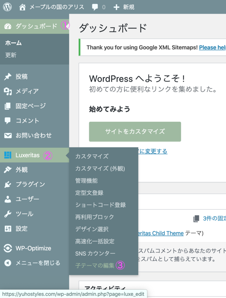
子テーマのCSSは「ダッシュボード」→「テーマ名」→「子テーマの編集」から編集が可能です。
わかりにくい場合は以下のリンクも参考にしてみてください。
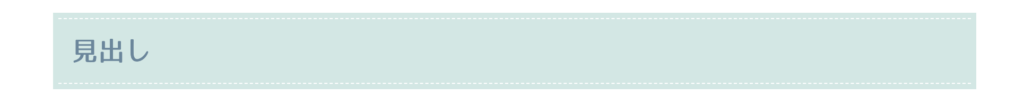
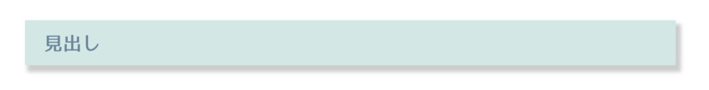
ステッチ風デザイン
このサイトで使用しているデザインです。好きな色に変更して使ってみてください。
.post h2 {
    font-family: WebLTGothicFont;/*フォント*/
    border: none;
    position: relative;
    padding: .5em 1em;
    background-color: #d2e7e4;/*背景色*/
    box-shadow: 0 0 0 5px #d2e7e4;/*背景色*/
    border-top: 1px dashed #fff;/*点線の色*/
    border-bottom: 1px dashed #fff;/*点線の色*/
}
色選びに迷った時は
配色に迷った時のおすすめ無料ツール も参考にどうぞ。
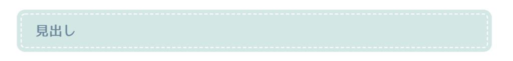
もっとステッチ風デザイン
丸みを持たせ、よりかわいらしい感じにしました。ハンドメイドブログなどに。
.post h2 {
    font-family: WebLTGothicFont;
    border: none;
    position: relative;
    padding: .5em 1em;
    background-color: #d2e7e4;/*背景色*/
    box-shadow: 0 0 0 7px #d2e7e4;/*背景色*/
    border: 2px dashed #fff;/*線の太さ、種類、色*/
    border-radius: 8px;/*角の丸み*/
}
ストライプデザイン
シャープな中にも可愛らしさを感じるデザインにしました。

.post h2 {
    font-family: WebLTGothicFont;
    border: none;
    position: relative;
    padding: .5em 1em;
    background: repeating-linear-gradient(-45deg, #edf5f4, #edf5f4 5px, #f6faf9 0, #f6faf9 10px);/*ボーダーの色*/
}
色違いピンクバージョン
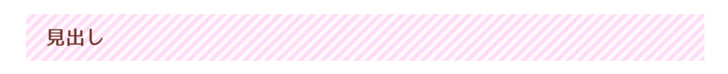
.post h2 {
    font-family: WebLTGothicFont;
    color: #6c3524;/*文字色*/
    border: none;
    position: relative;
    padding: .5em 1em;
    background: repeating-linear-gradient(-45deg, #ffdbf6, #ffdbf6 5px, #fef9fb 0, #fef9fb 10px);
}
🌾colorタグで文字の色を変更できます。指定しない場合、本文と同じ色になります。
ドット柄
ちょっとレトロでかわいらしい感じのデザインです。
お菓子作り系や、読者を女性に向けたサイトにおすすめ。

.post h2 {
    font-family: WebLTGothicFont;
    color: #6c3524;/*文字色*/
    border: none;
    position: relative;
    padding: .5em 1em;
    background-color: #ffdbf6;/*背景色*/
    background-image: radial-gradient(#fff 20%, transparent 0), radial-gradient(#fff 20%, transparent 0);/*ドットの色*/
    background-position: 0 0, 8px 8px;/*ドットの位置*/
    background-size: 15px 15px;/*ドットの大きさ*/
}
浮かび上がったように見える立体的なデザイン
影をつけることで、浮いているかのように立体的に見せることが可能です。
.post h2 {
    font-family: WebLTGothicFont;
    border: none;
    position: relative;
    padding: .5em 1em;
    background-color: #d2e7e4;
    box-shadow: 5px 7px 5px 2px #ccc;/*影*/
}
グラデーション付き
見出し自体にグラデーションをつけてより立体感を加えました。よく目立つのでh2におすすめです。
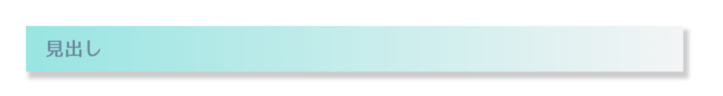
.post h2 {
    font-family: WebLTGothicFont;
    border: none;
    position: relative;
    padding: .5em 1em;
    box-shadow: 5px 7px 5px 2px #ccc;/*影*/
    background: linear-gradient(to right, #95e5e2, #f3f4f5);/*背景のグラデーション*/
}
付箋風
シンプルでかわいい付箋風です。どんなブログジャンルにもおすすめ。
左側にのみ太めのボーダーを付けることで、付箋風に見せています。
フラット

.post h2 {
    font-family: WebLTGothicFont;
    border: none;
    position: relative;
    padding: .5em 1em;
    background-color: #f7f6fb;/*付箋の色*/
    border-left: 20px solid #f783ac;/*左端のポイント色*/
}
立体風
小さな影を付けることで、より本物の付箋に近いデザインになります。
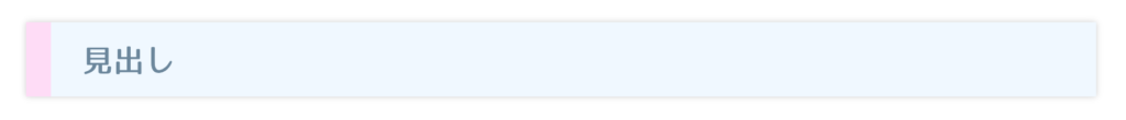
.post h2 {
font-family: WebLTGothicFont;
border: none;
position: relative;
padding: .5em 1em;
background-color: #f0f8ff;/*付箋の色*/
border-left: 20px solid #ffdbf6;/*左端のポイント色*/
box-shadow: 0 0 5px rgba(0,0,0,0.2);/*影*/
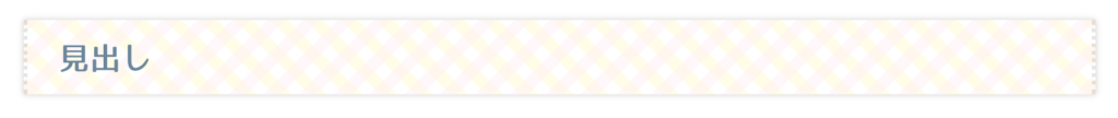
}マステ風
複数のCSSを組み合わせることで、マスキングテープ風もできます。
コードは少し長くなりますが、その分かわいくなるので頑張ってチャレンジしてみてください。
シンプル
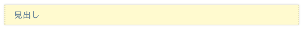
.post h2 {
    font-family: WebLTGothicFont;
    border: none;
    position: relative;
    padding: .5em 1em;
    background-color: #fffacd;/*テープの色*/
    border-left: 3px dotted rgba(0,0,0,0.1);/*切れ端*/
    border-right: 3px dotted rgba(0,0,0,0.1);/*切れ端*/
    box-shadow: 0 0 5px rgba(0,0,0,0.2);/*影*/
}
ドット柄
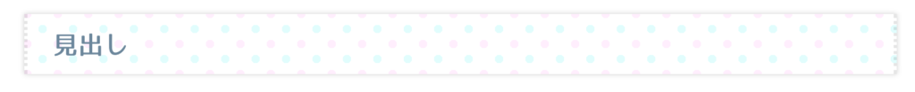
.post h2 {
    font-family: WebLTGothicFont;
    border: none;
    position: relative;
    padding: .5em 1em;
    background-image: radial-gradient(#e0fdfd 20%, transparent 0), radial-gradient(#ffedfd 20%, transparent 0);/*ドットの色*/
    background-position: 0 0, 15px 15px;/*ドットの位置*/
    background-size: 30px 30px;/*ドットの大きさ*/
    border-left: 3px dotted rgba(0,0,0,0.1);
    border-right: 3px dotted rgba(0,0,0,0.1);
    box-shadow: 0 0 5px rgba(0,0,0,0.2);
}
チェック柄
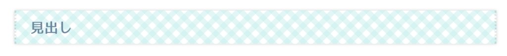
.post h2 {
    font-family: WebLTGothicFont;
    border: none;
    position: relative;
    padding: .5em 1em;
    background-image: repeating-linear-gradient(-45deg,rgba(198, 238, 238, .5), rgba(198, 238, 238, .5) 10px, transparent 0, transparent 20px), repeating-linear-gradient(45deg,rgba(198, 238, 238, .5), rgba(198, 238, 238, .5) 10px, transparent 0, transparent 20px);/*チェックの色*/
    border-left: 3px dotted rgba(0,0,0,0.1);
    border-right: 3px dotted rgba(0,0,0,0.1);
    box-shadow: 0 0 5px rgba(0,0,0,0.2);
}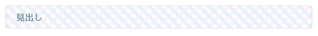
.post h2 {
    font-family: WebLTGothicFont;
    border: none;
    position: relative;
    padding: .5em 1em;
    background-image: repeating-linear-gradient(-45deg,rgba(253, 230, 251, 0.5), rgba(253, 230, 251, 0.5) 10px, transparent 0, transparent 20px), repeating-linear-gradient(45deg,rgba(198, 238, 238, .5), rgba(198, 238, 238, .5) 10px, transparent 0, transparent 20px);/*チェックの色*/
    border-left: 3px dotted rgba(0,0,0,0.1);
    border-right: 3px dotted rgba(0,0,0,0.1);
    box-shadow: 0 0 5px rgba(0,0,0,0.2);
}
.post h2 {
    font-family: WebLTGothicFont;
    border: none;
    position: relative;
    padding: .5em 1em;
    background-image: repeating-linear-gradient(-45deg,#fff0f580, #fff0f580 10px, transparent 0, transparent 20px), repeating-linear-gradient(45deg,#fffacd80, #fffacd80 10px, transparent 0, transparent 20px);/*チェックの色*/
    border-left: 3px dotted rgba(0,0,0,0.1);
    border-right: 3px dotted rgba(0,0,0,0.1);
    box-shadow: 0 0 5px rgba(0,0,0,0.2);
}
下線ストライプ
シンプルでどんなブログにも合わせやすいデザインです。
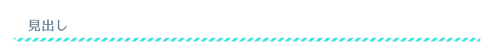
.post h2 {
    font-family: WebLTGothicFont;
    border: none;
    position: relative;
    padding: .5em 1em;
}
h2:after {
    content: '';
    position: absolute;
    left: 0;
    bottom: 0;
    height: 7px;
    width: 100%;
    background-image: repeating-linear-gradient(-45deg, #24e5df, #24e5df 5px, #f6faf9 0, #f6faf9 10px);
}
ちなみに、シンプルに単色の線にすることも可能です。
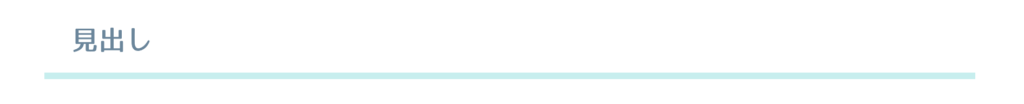
.post h2 {
    font-family: WebLTGothicFont;
    border: none;
    position: relative;
    padding: .5em 1em;
    border-bottom: 6px solid #c6eeee;
}
アイコン付き
少し慣れた人向けになりますが、FontAwesomeと合わせることで、アイコン付きの見出しも作ることが可能です。

.post h2 {
    font-family: WebLTGothicFont;
    border: none;
    position: relative;
    padding: .5em 2em .1em 1em;
    border-bottom: 5px solid #c6eeee;
}
.post h2::before {
    content: "\f005 ";/*アイコンのユニコード*/
    font-family: "Font Awesome 5 Free";
    font-size: 1.1em;/*アイコンの大きさ*/
    color: #f9aff3;/*アイコンの色*/
    margin-right: .3em;/*アイコンと文字間の距離*/
}
FontAwesomeを導入していない場合は、以下のコードをheader内に記載します。
<link rel="stylesheet" href="https://use.fontawesome.com/releases/v5.6.3/css/all.css">スイスチーズ風
ドット柄の応用で、チーズっぽくできます。料理ブログなどに。
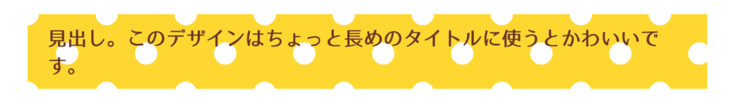
.post h2 {
    font-family: WebLTGothicFont;
    color: #6c3524;
    border: none;
    position: relative;
    padding: .5em 1em;
    background-color: #ffd900;
    background-image: radial-gradient(#fff 20%, transparent 0), radial-gradient(#fff 20%, transparent 0);
    background-position: 0 0, 50px 50px;
    background-size: 100px 100px;
最後に
以上!参考になれば幸いです。
こんなデザインが欲しい、などリクエストもお待ちしております!
それでは良いブロガーライフを😄